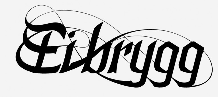
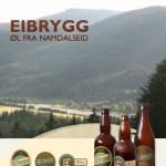
Eibrygg, packaging and identity concepts
Eibrygg a play on words with the name of someone from the region in quiestion: Namdalseid / Eibygg. The idea was to have an umbrella brand for multiple home brewed beers. As far as I know there idea is not currently being used.
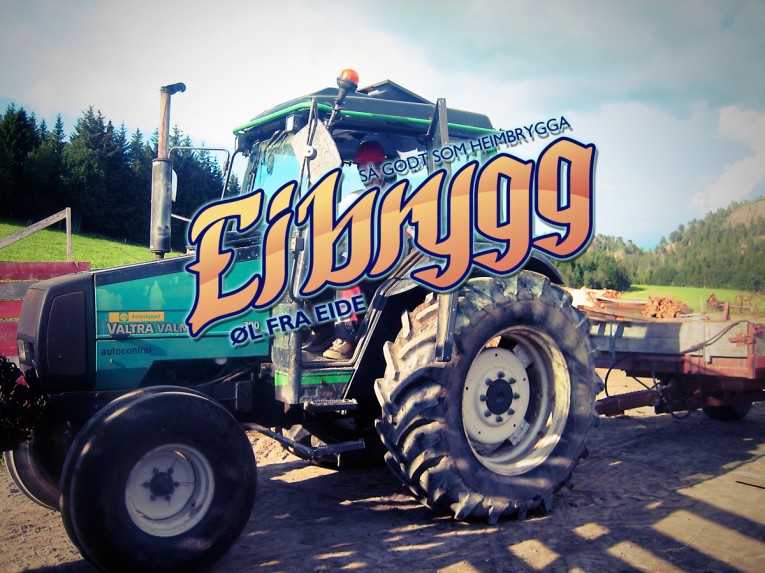
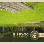
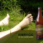
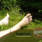
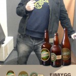
The general theme is some sort of farmer-punk style, borrowing from old nordic woodcarving and painting styles, combined with current and preferably amateur photos.
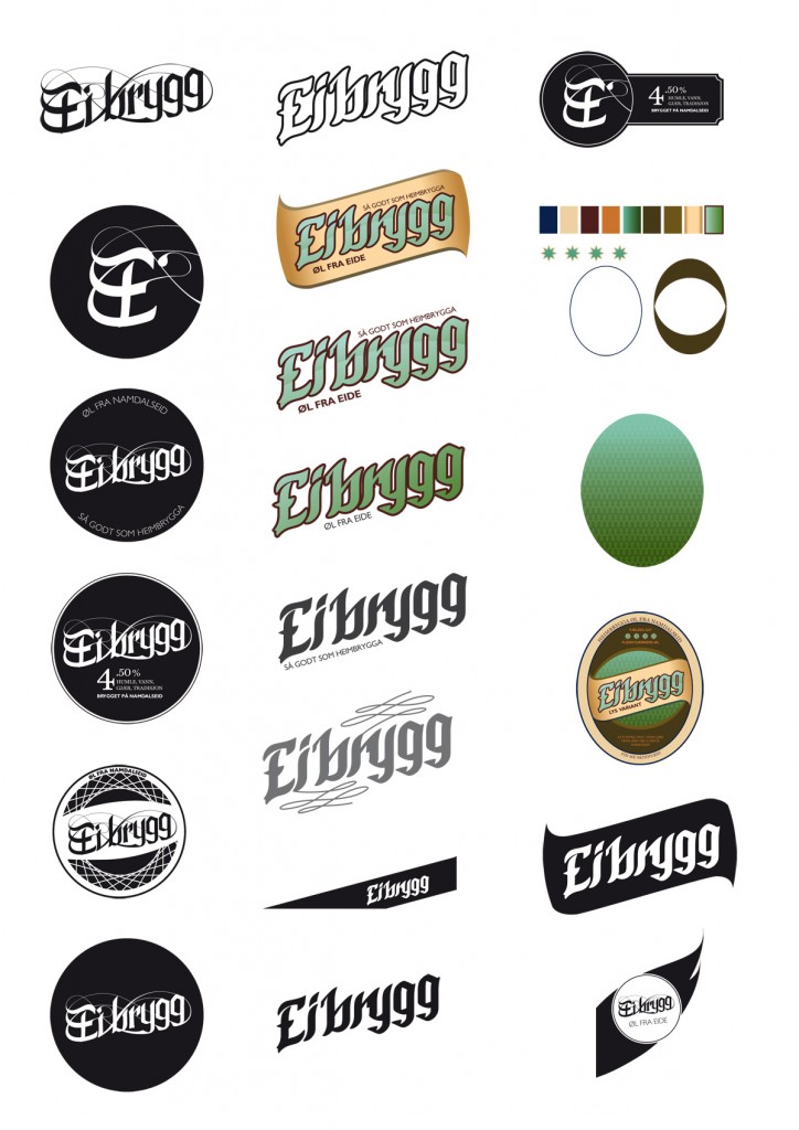
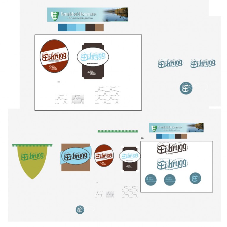
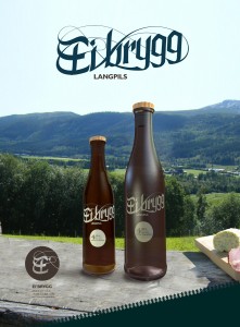
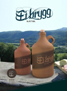
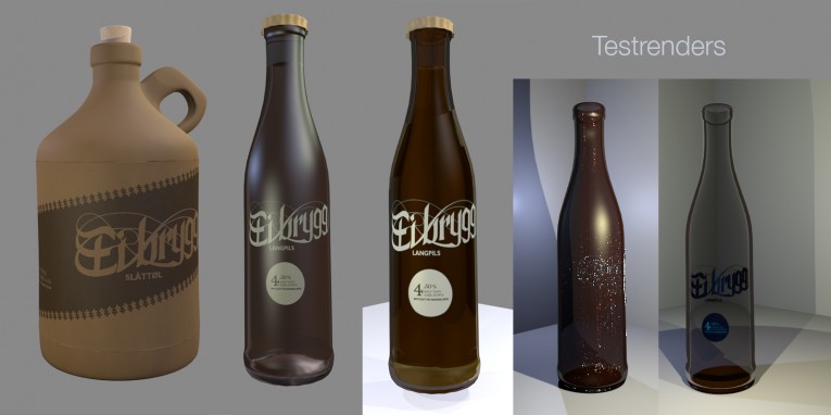
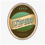
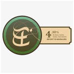
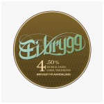
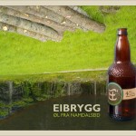
Sketches include renders of bottles, image styles and logotype, culiminating in 3 distinct types/ labels presented as posters (See bottom of page).
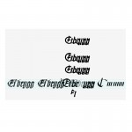
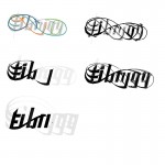
Logotype process:
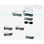
Label Sketches
For the sake of viability, I ended up sticking to actual bottles.Turns out custom bottles are hard to come by.
Final results
