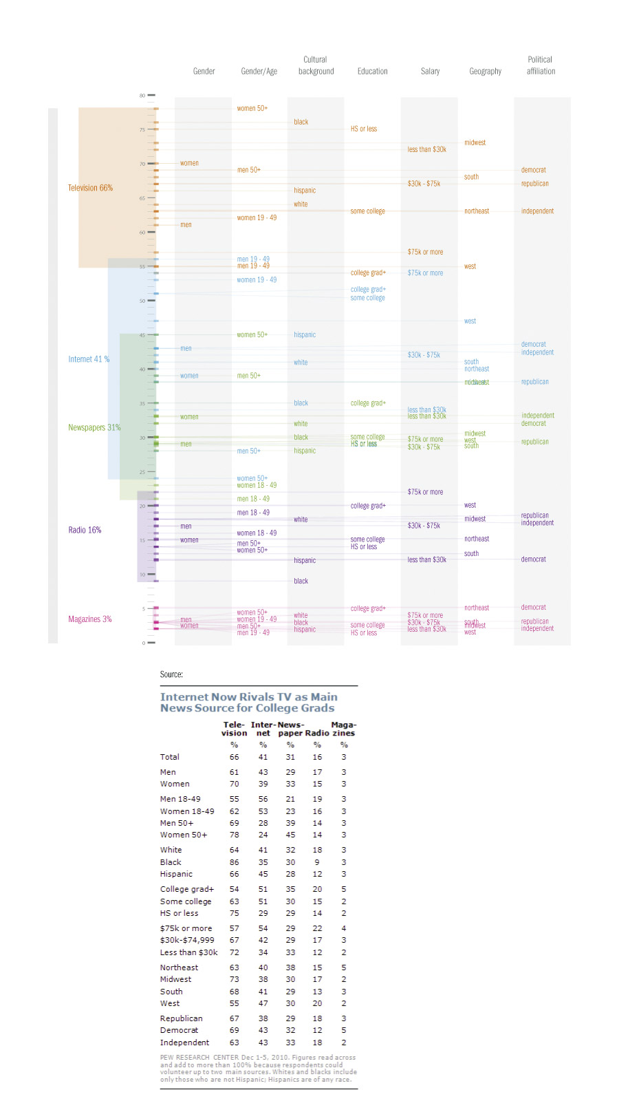
Newssources 2010, sketching
A brief play with numbers in illustrator, based on this post, over at Flowingdata.com. As the main question had been answered by many very good submissions already, I had a go at making the demographic data more informative.
The research and data comes from The Pew Research Center, and counts where US citizens get their news.
The picture below sorts the news-sources and percentage of mentions as a main news-source along the Y-axis. The demographic groups are sorted along the X-axis.
The intent was to make it more feasible to find the main users of a medium and how different demographics get their news, as well as the popularity of a news source.
Click for larger picture.
Full picture available here.
