Roadtrip 2009
This poster (800×1000mm) was designed to summarize and explain the summer holiday of 2009: a roadtrip/ moving house expedition undertaken by my partner Marthe and I, from Norway to England and back.
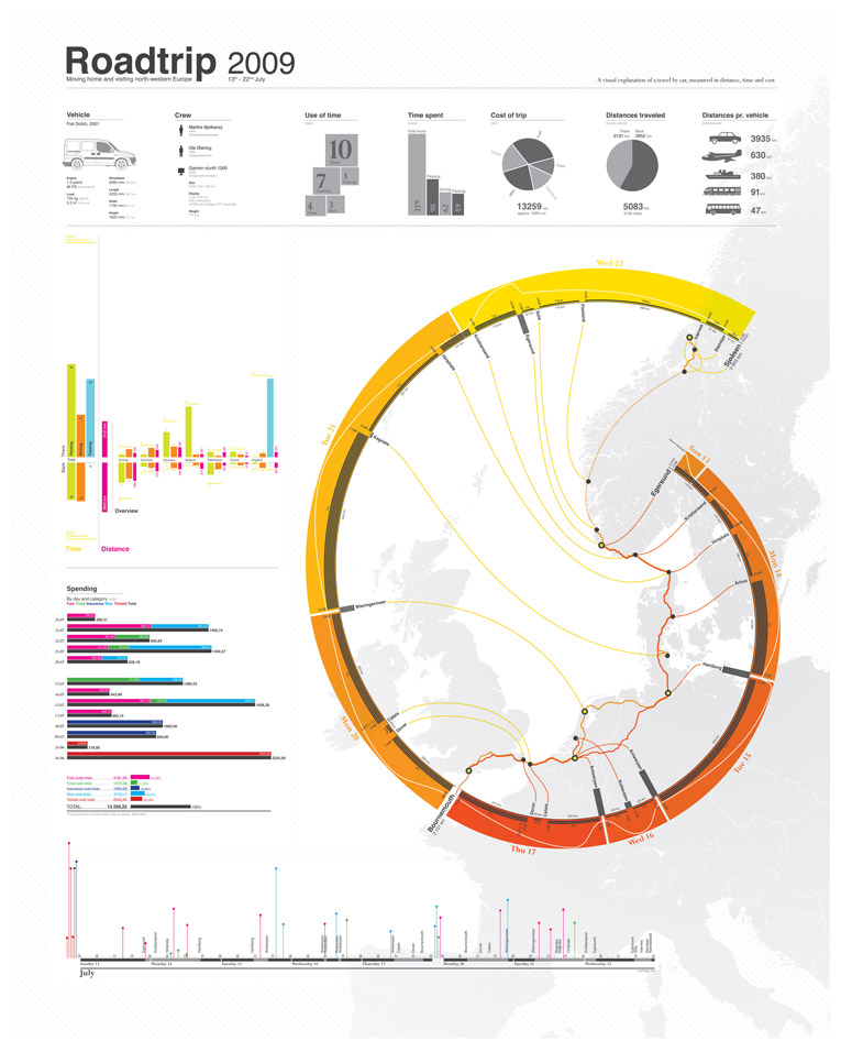
It started as a tool for keeping track of costs, but was developed into a full trip overview as more details were added. Key data such as cost, distance and time are presented in various ways to create a rich data log.
After I submitted the poster to infosthetics.com, it can now be found on several infographic aggregate blogs and inspirational lists around the web, such as ffffound, yayeveryday, vizworld and datavisualization.ch.
Full poster, zoomable:
Details:


Full poster, image:

really great. i love it.
That is superawesome; how long did the viz take?
[…] This post was mentioned on Twitter by VISup, alex_osman. alex_osman said: Nice road trip graphics: http://bit.ly/2qtbqW #infographics […]
Thanks guys, glad you liked it. There is probably around a weeks worth of work in there, with collecting data and processing it included. The single most time consuming task was probably drawing the map, that I ended up using only a quarter of in the end.
Can you share the raw data format?
Hi Martin,
not quite sure about what you’re asking for, but the raw data consists mainly of handwritten notes, bank statements and other “evidence” such as timestamps on pictures and personal recollection. In case you are looking for the Illustrator file, I have to respectfully decline as it would be a lot of work editing out sensitive data and collecting all the bits and pieces together (unless you really, really want it).
[…] oostring/weblog » Roadtrip poster final. Related News & Resources WSJ Home Default Rates Infographic USA Today Infographic […]
Really nice graphic, which raises two questions: 1) 59 hours packing? 2) Why Bournemouth of all places? :-)
Hi Adam,
thanks for asking. 1: 59 hours refers roughly to the time spent in Bournemouth between “there’ and “back”, where the main objective was to evacuate the flat and load the car. Obviously the category “packing” contains a bit of sleep and eating as well, but it is mainly meant to hold the hours not spent in transit. 2: See 1.
[…] Roadtrip 2009 – Moving Home and Visiting North-Western Europe [oostring.com] is an infographic poster specifically designed to summarize and explain Ole Ostring’s summer holiday of 2009, including a roadtrip/ moving house expedition undertaken from Norway to England and back. It originally started as a tool for keeping track of costs, but was developed into a full trip overview as more details were added. […]
[…] Roadtrip 2009 – Moving Home and Visiting North-Western Europe [oostring.com] is an infographic poster specifically designed to summarize and explain Ole Ostring's summer holiday of 2009, including a roadtrip/ moving house expedition undertaken from Norway to England and back. It originally started as a tool for keeping track of costs, but was developed into a full trip overview as more details were added. […]
Social comments and analytics for this post…
This post was mentioned on Twitter by davidegenco: An infographic road trip…http://www.oostring.com/weblog/?p=181…
Hey Oostring very nice Viz! but what were you doing in “the wieringermeer”, :-)
Hi Tim,
we spent the night at a motel in order to drive across the water in the early morning. It was a beautiful day, and a very nice piece of road.
Hi Ole,
Great map! But what are the black bands (or stripes) inside the yellow and orange rings? Sometimes they seem to indicate the number of hours a leg of the trip took you – for example, on the Antwerpen-Rotterdam-Antwerpen bit; but sometimes, it doesn’t – only two stripes for Kegnaes-Hirtshals, instead of three, and no stripes from Dover to Calais.
Hi Martijn,
Thanks for noticing :) Those black bands are a bit odd. They are directly linked to driving/resting, but then you have other stuff, as waiting, wrong turn and hanging out at gas stations. In part, a low detail record of time-keeping is to blame, but the official explanation is that I didn’t want too many categories.
Between Dover and Calais arrival at Calais is at 13.00, start from Dover is at 18.00, with only one hour noted as travel-time (an approximation). This is because of the change of time-zone, waiting for the ferry and buying croissants.
[…] info, acercamientos y PDF acá […]
[…] from oostring.com October 29th, 2009 | found in design […]
[…] a comment » Roadtrip 2009 – Moving Home and Visiting North-Western Europe [oostring.com] is an infographic poster specifically designed to summarize and explain Ole […]
[…] a comment » Roadtrip 2009 – Moving Home and Visiting North-Western Europe [oostring.com] is an infographic poster specifically designed to summarize and explain Ole […]
[…] infographic design by Ole Østring. via Jacob […]
Gorgeous. Congratulations!
Thanks, glad you liked it.
Where did you get the vector world map?
Did you only use Illustrator or maybe Processing or Excel …
Is this maybe a Script-Programm or only hard illustrator work?
It’s Amazing!!!
Thanks for the kind words. It is quite low-tech, illustrator only. Map is also made in illustrator, quite quick when only drawing with straight lines.
[…] november 3, 2009 Sam Decrock Plaats een reactie Go to comments Op http://www.oostring.com/weblog/?p=181 staat een poster die een roadtrip moet voorstellen. Oorspronkelijk gemaakt om te zien waar al het […]
[…] http://www.oostring.com/weblog/?p=181 http://yayeveryday.com/post/8040 November 30th, 2009 […]
[…] RoadTrip […]
[…] a good story from facts on charity activities here. But below you will find a beautiful story on a Roadtrip (made by […]
[…] Roadtrip poster […]
[…] RoadTrip […]
[…] Roadtrip poster […]
[…] Roadtrip poster […]
[…] resultado e outras imagems desse experimento de data visualization pode ser visto aqui. design aesthetics information, data visualization, design, […]
Hi,
Great visualisation. I’m creating a tool to generate your visualisation.
Can you explain what the dark bars are? You explained it before, but I still don’t understand it…
thanks
Sam
Hi Sam,
Thanks, the dark bars indicate time spent (in hours, roughly) either in on location, or across a distance. the more bars stacked the more hours spent, the longer they are, the more we moved in that time.
Hope this clarifies the issue.
Ole
[…] 27, 2010 Ole Østring’s visual account of his 2009 European road trip Roadtrip […]
[…] Roadtrip 2009 […]
Really nice work !
[…] diese seite hat mir sehr geholfen die implementierung von openzoom in einen wordpress blog zu verstehen, also zuerstmal mein link zu oostring.com. […]
[…] days agoFiled UnderTumblrTaggeddesignjacobOle Wonderful infographic design by Ole Østring. via Jacob Heftmann 1 commentRetweet This Post The DiscussionOne Comment on “Wonderful […]